Lo-Cal Website
A website that complements the brand
Concept
A sit in restaurant where you can buy the food you eat in a ready meal pack with instructions to make the food just like the chef.
Taking the Lo-Cal Experience home.
The Lo-Cal food will be organic and homegrown with low calories.


Message
I want to communicate the brand through this website. It should be an extension to the Lo-Cal brand and a port of call for people who want to come to the restaurant or order ready meals. To do this I wanted to communicate;
The low calorie aspect of the meals so people know they are healthy, a big part of the Lo-Cal concept.
+ The brand identity through the changing logo and the clean and professional feel of the brand.
+ The high-class elegance of the restaurant.
+ The type of food the restaurant offers.

Rationale
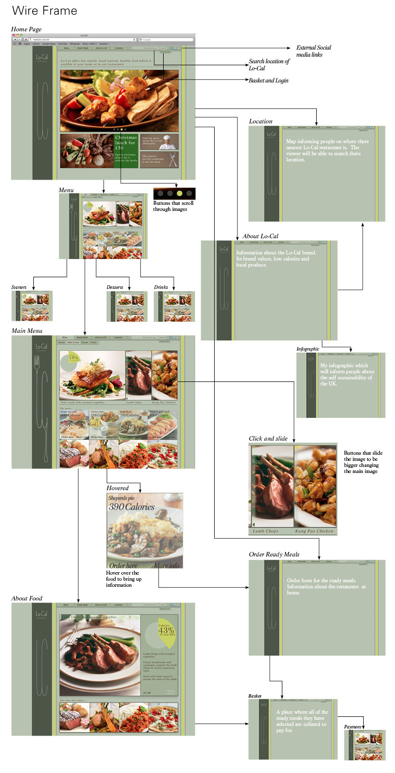
I created this website to have a simple navigation system and a limited amount of pages so it was easy to use and immediate for the viewer. When looking at restaurant menus the viewer wants immediate information and not to trawl through loads of information. In addition, this idea of a simple to use site will match the ideal of the sleekness of the brand.
I wanted to carry on the brand identity through the website. I did this by having the three stripes used around the website. I also did this by changing the logo for each of the pages to the relevant logo and keeping to my original colour palette I used for the brand.
I did not want to use the packaging of the ready meals to advertise my ready meals on the site, as I do not think taking pictures of a print material is an effective way of representing the product. I used photos to represent the menu and a hover feature to inform the viewer what this dish is.
The infographic was included to create another aspect to the site that competitors will not have. It gives the viewer immediate information about the dish and adds another selling point.